attune
A healing organisation that provides a positive space to ‘tune in’ and be on the same wavelength as their clients.
Challenge
attune is a pioneering mental health and well-being service with a mission to disrupt the mental health space, specifically catering to the entertainment and sports industries.
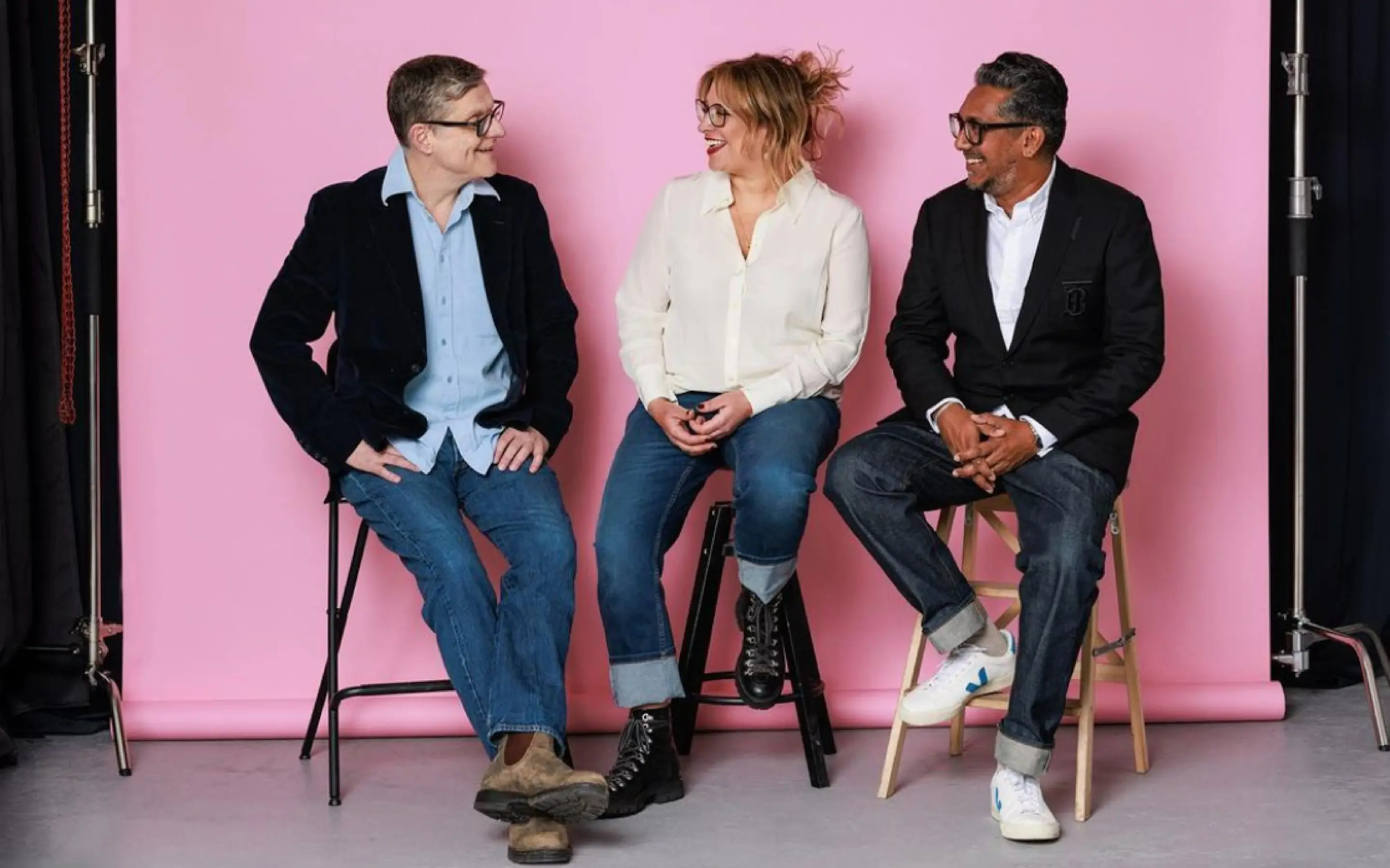
The service was founded by three established experts – former artist manager Sam Parker, music industry veteran Matt Thomas, and psychotherapist and former musician Chula Goonewardene. They established attune with a shared mission to support individuals, teams, and entire organisations across talent-focused industries, from music and sports to wider entertainment.
Our task was to create a visual and verbal identity that captured the service’s unique blend of warmth, creativity, and clinical excellence.
Approach
The brand workshop with Sam, Matt, and Chula was lively, yielding a unique brand personality and new identity. Key to the new brand was conveying their acute client attunement, positioning them as the 'rock and roll' of mental health, inspired by art and culture (including a mandatory touch of Sam's beloved pink).
They were enthusiastic about using offset elements to capture the mental shift – the tension experienced before and the resolution found after engaging with their service. This guiding principle led our visual exploration into how typography and colour could best communicate this transition.
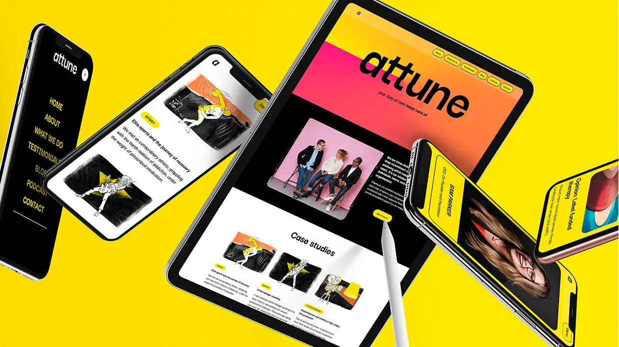
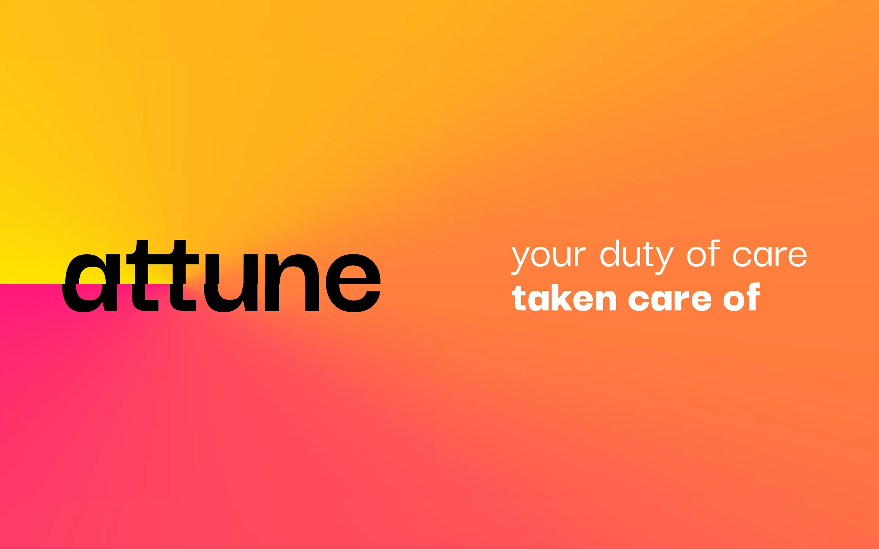
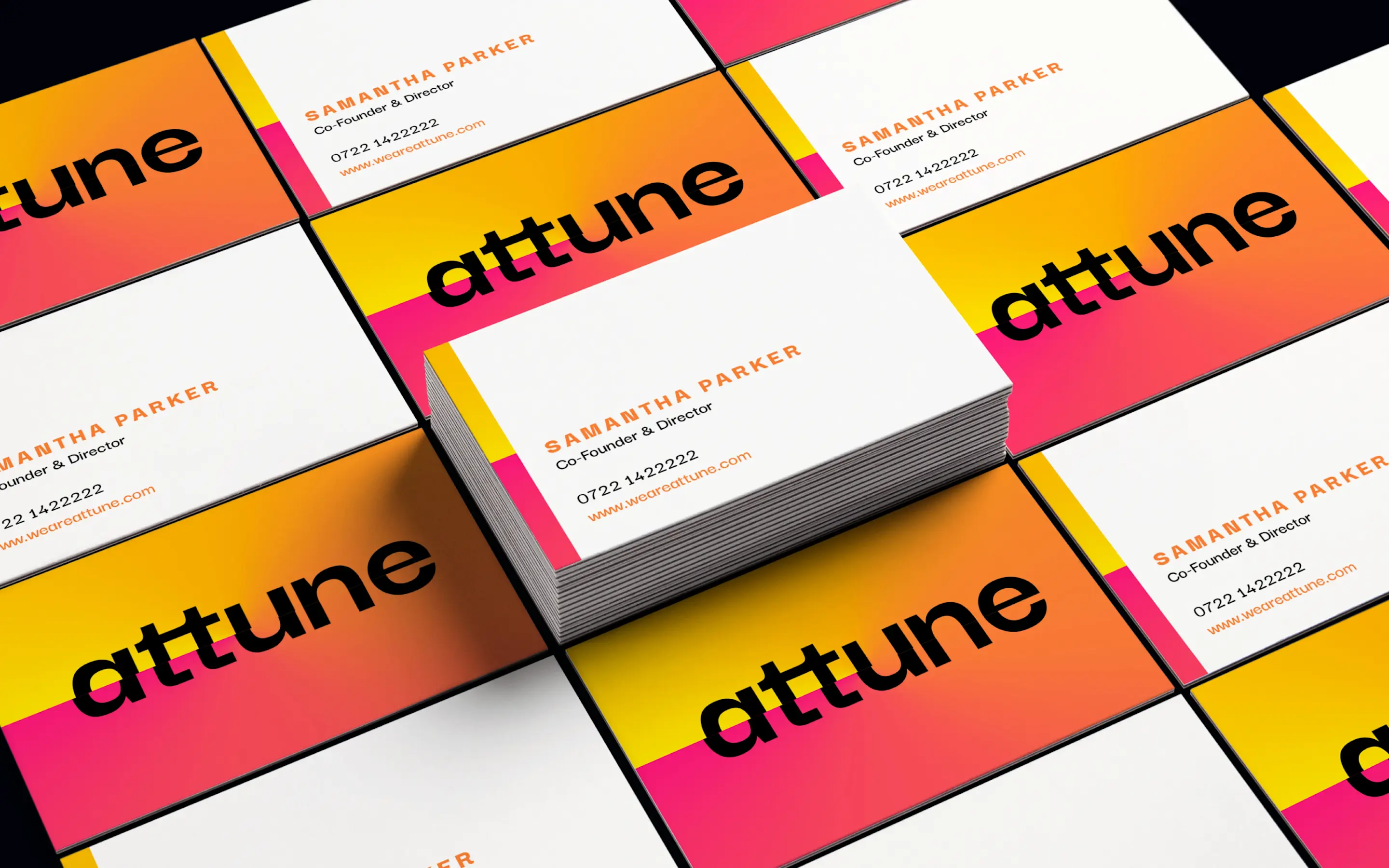
The humble 'attune' wordmark with lowercase letters utilises a gradual shift in letterforms to communicate the tension-to-resolution journey, while the 'disruptor' colours of yellow, pink and orange used in a 'pivot' point reinforce this perfectly. A confident, post-modern Darker Grotesque typeface was chosen for its bold and disruptive personality.
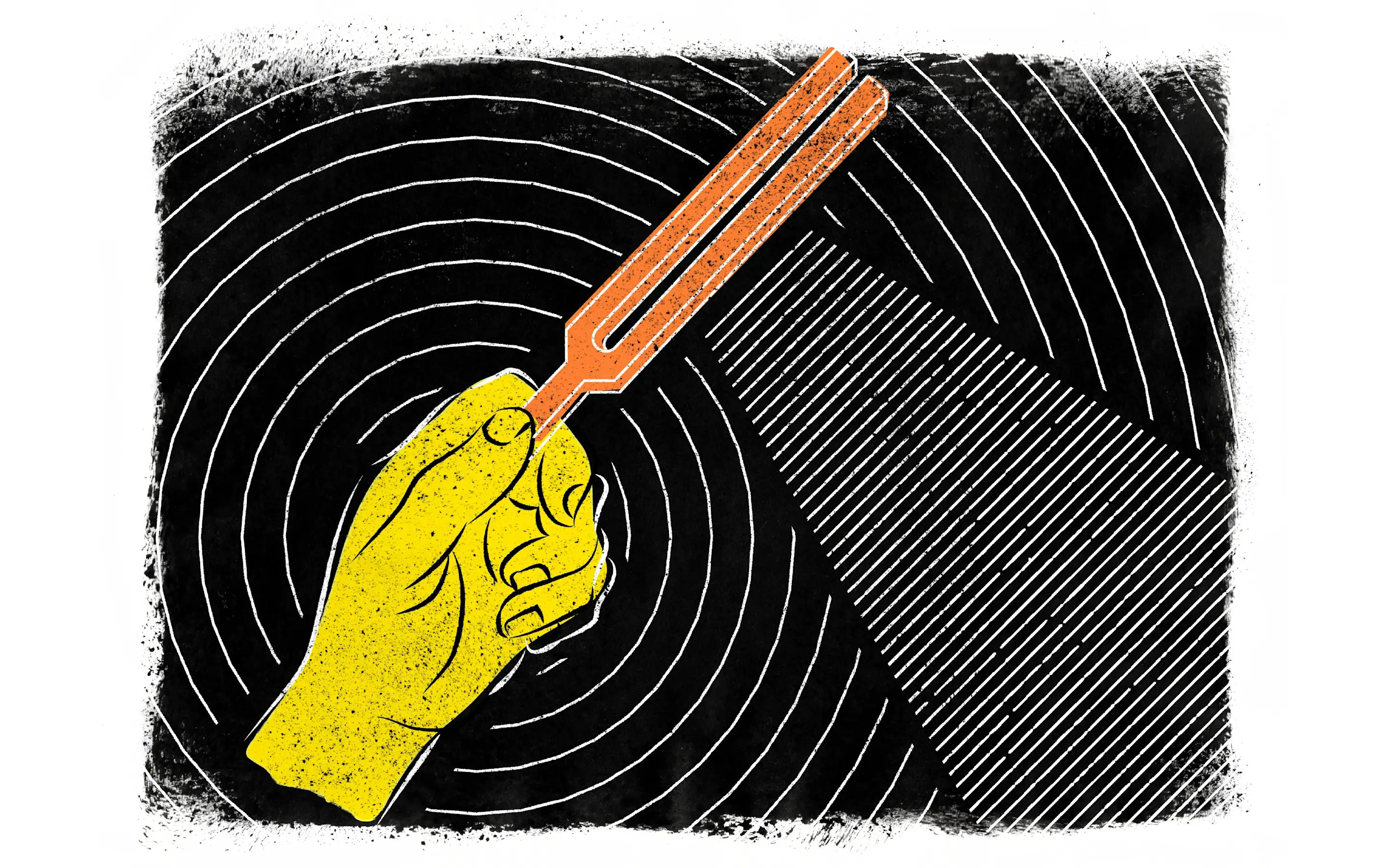
The ‘Tone of Voice’ workshop defined their ‘Wizard talk’ style and allowed them to understand that the jargon they used was confusing to normal people, so a new language emerged that was clear, approachable and simple. This clarity informed the design of energetic, human, and distinctive infographics and illustrations.
Outcome
attune has established itself as a disruptive force in the mental health sector, with a brand identity that strongly resonates with its clientele across all three service areas. The company has successfully expanded its reach to include the sports and entertainment industries, in addition to its work in music. They boast extensive positive client testimonials, featuring numerous success stories detailing the impact of their assistance. Key partnerships include collaborations with Google, Premier League Football Club, and the Music Managers Forum.
Deliverables
Brand personality workshop
Tone of voice workshop
Visual identity – logo, colourways, typography
Brand book + asset kit
Website design in Figma and built in Webflow, including CMS
Marketing materials + sales presentations
Instagram account setup + social tiles
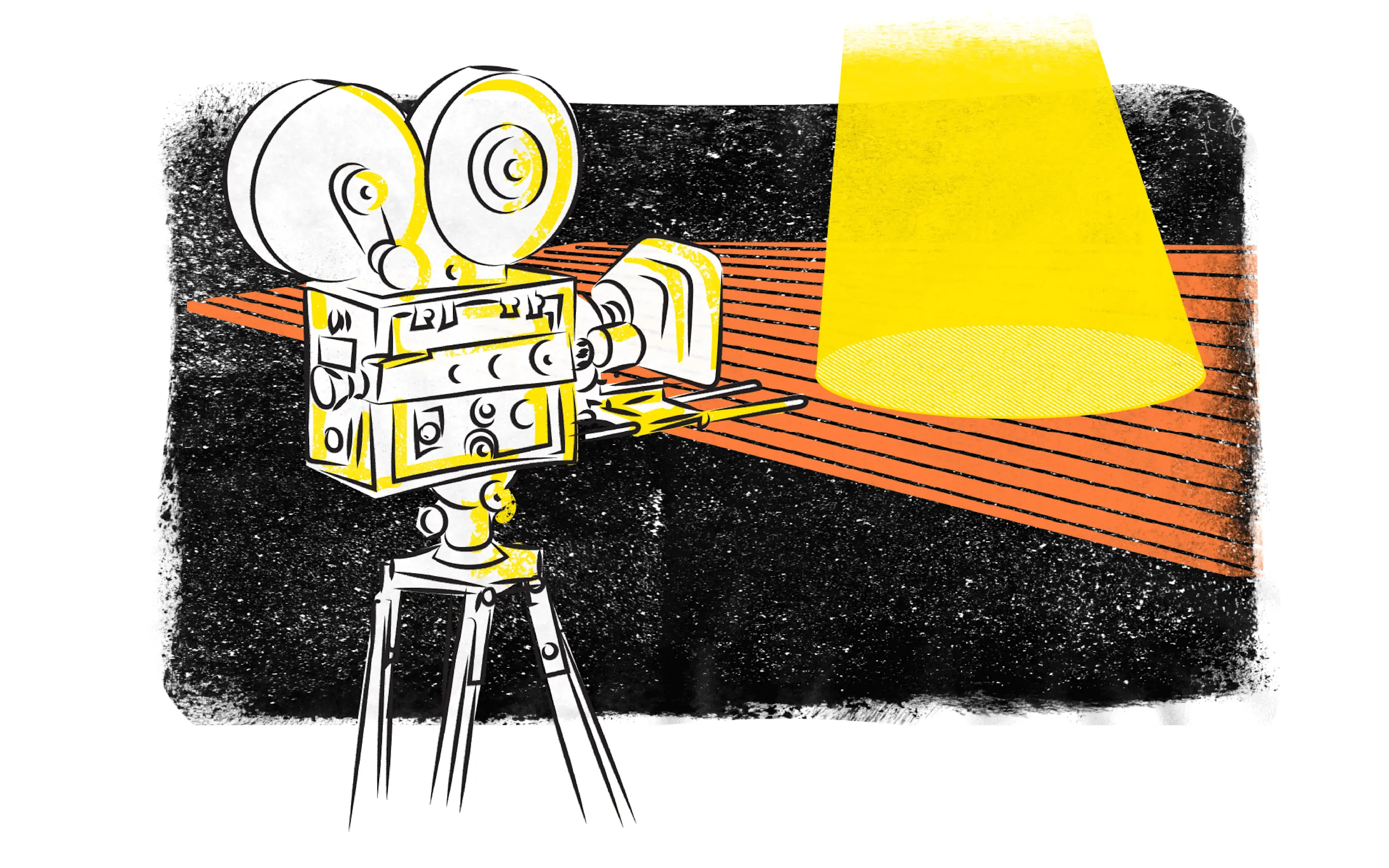
Custom illustrations + infographics
“Another Acronym is a fantastic branding and design agency. They wanted to understand our company and what makes us, as founders, tick. This has led to an amazing result which we are all delighted with, despite our very different aesthetics. They are the creative force behind the attune company storytelling and design.”
Sam Parker, Founder, attune