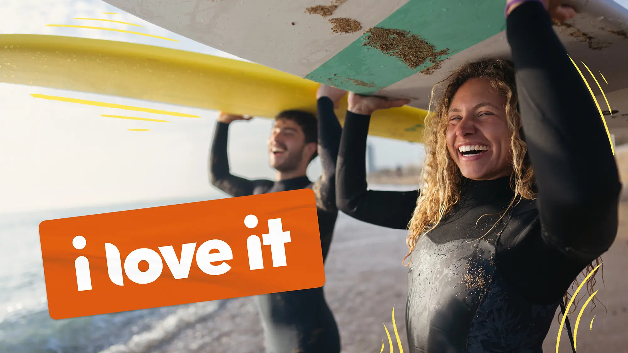
i love it
If you love it, share it – creating a brand that puts Gen Z at the centre of people-powered shopping.
Challenge
When ili came to us originally, they were called QRTD (pronounced Curated). The challenge was that as the offering was being developed, it no longer matched the brand and coupled with a change in market and audience, a few things had to change.
Approach
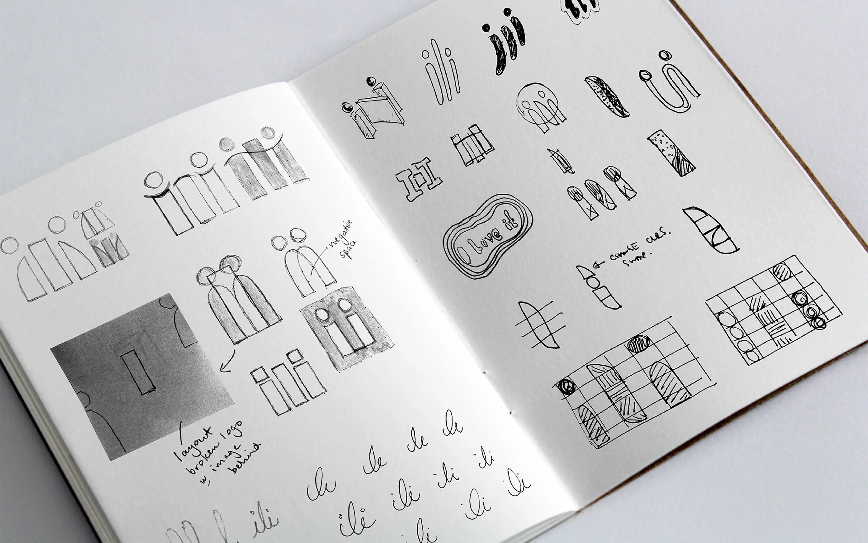
The concept of ‘Making your mark’ captures the essence of a generation – Gen Z – that craves authentic, tangible experiences in an increasingly digital world. This approach brings vibrant energy to the brand, reflecting the diversity and creativity of the people it represents. The visual identity feels like a dynamic scrapbook: playful, layered, hand-drawn, and slightly chaotic, evoking a sense of nostalgia with an ‘old school’ aesthetic. It celebrates the imperfect and the real, inviting brands and audiences to engage with their genuine content.
Outcome
As the project evolved, the core audience became clear: Gen Z early adopters. While the platform needed to speak to both B2B and B2C users, the brand was built to resonate with a digitally native, values-driven generation.
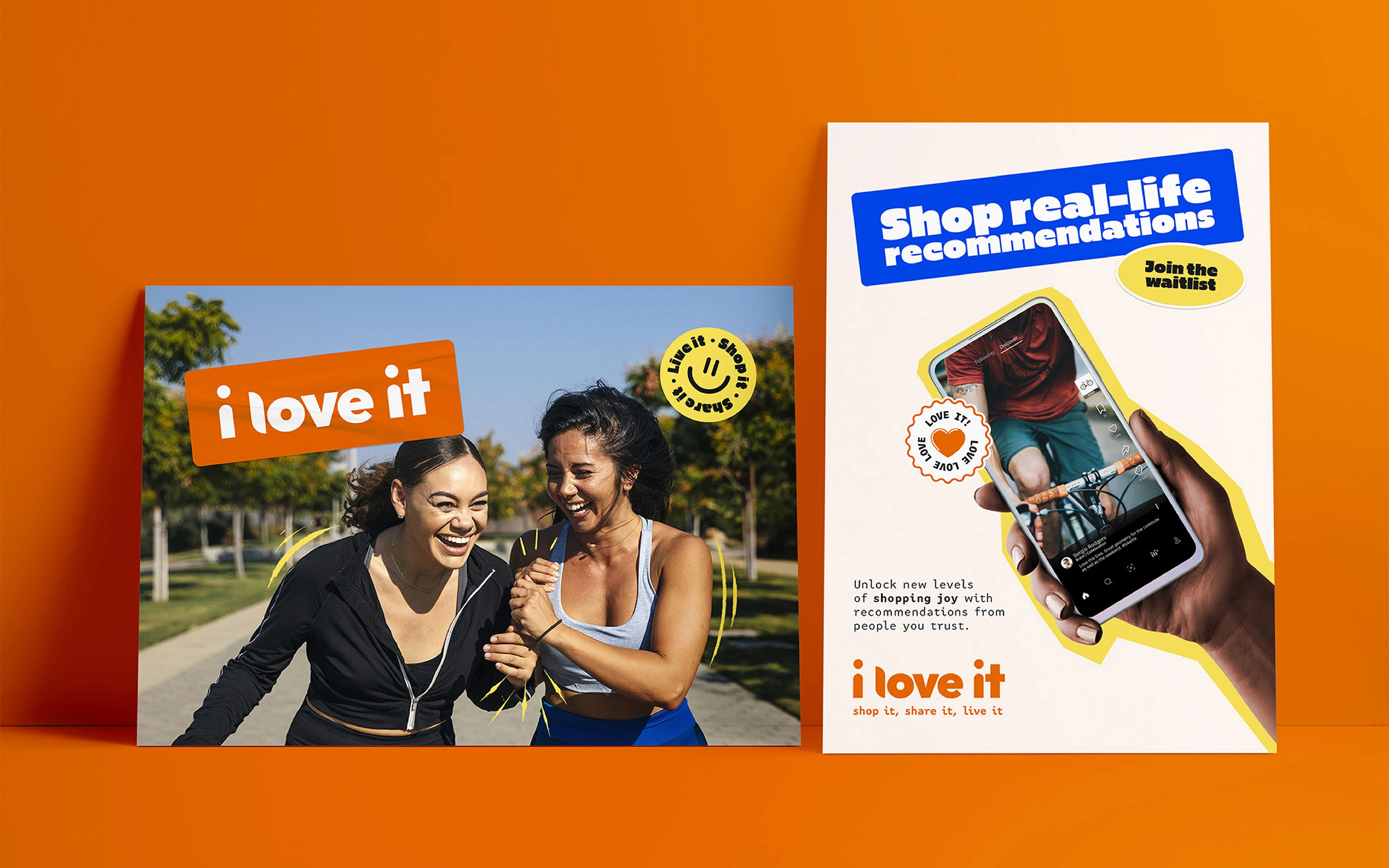
ili is bold and playfully disruptive. It embraces imperfection, feels authentic and unfiltered, and champions fairness in social commerce. A focus on fairness invites everyone to believe in better and to shop with their heart and love for the planet.
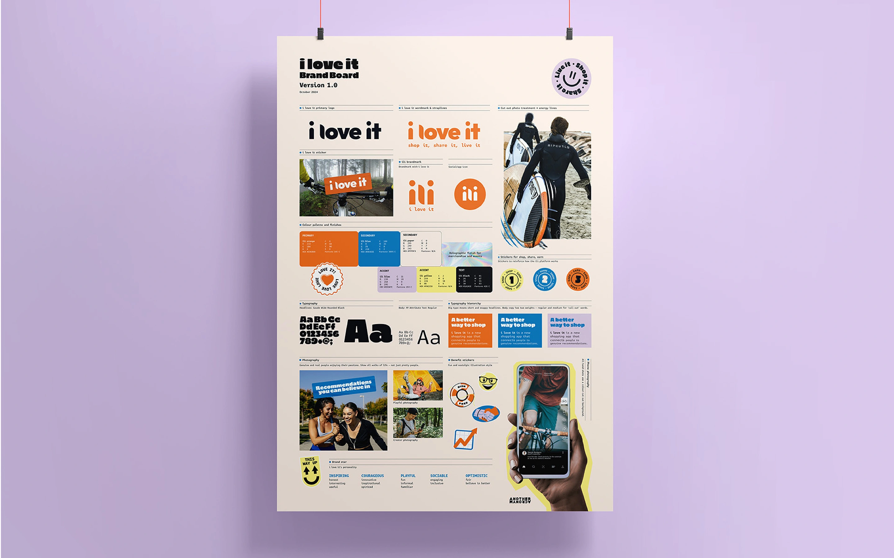
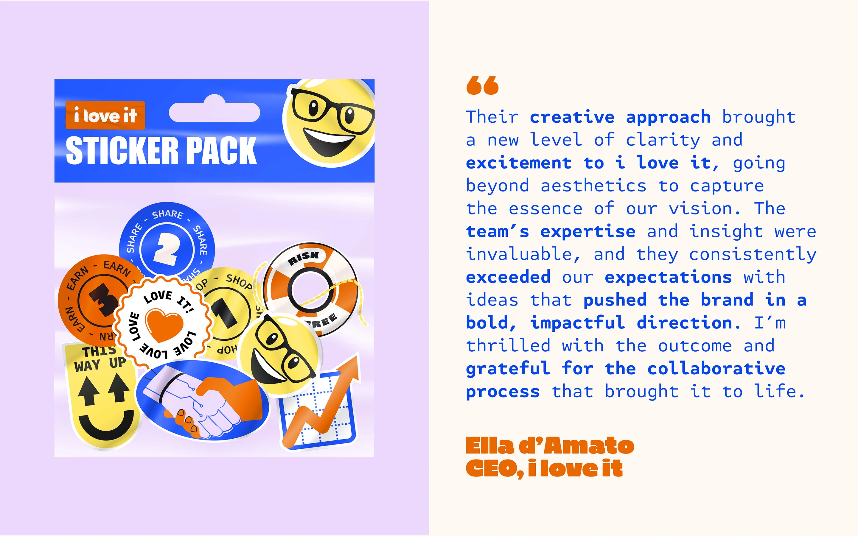
The logo distils the idea of recommendation into a minimal mark. Lowercase ‘i’ characters peek over the central ‘l’, like neighbours talking over a garden fence, signalling conversation and trust.
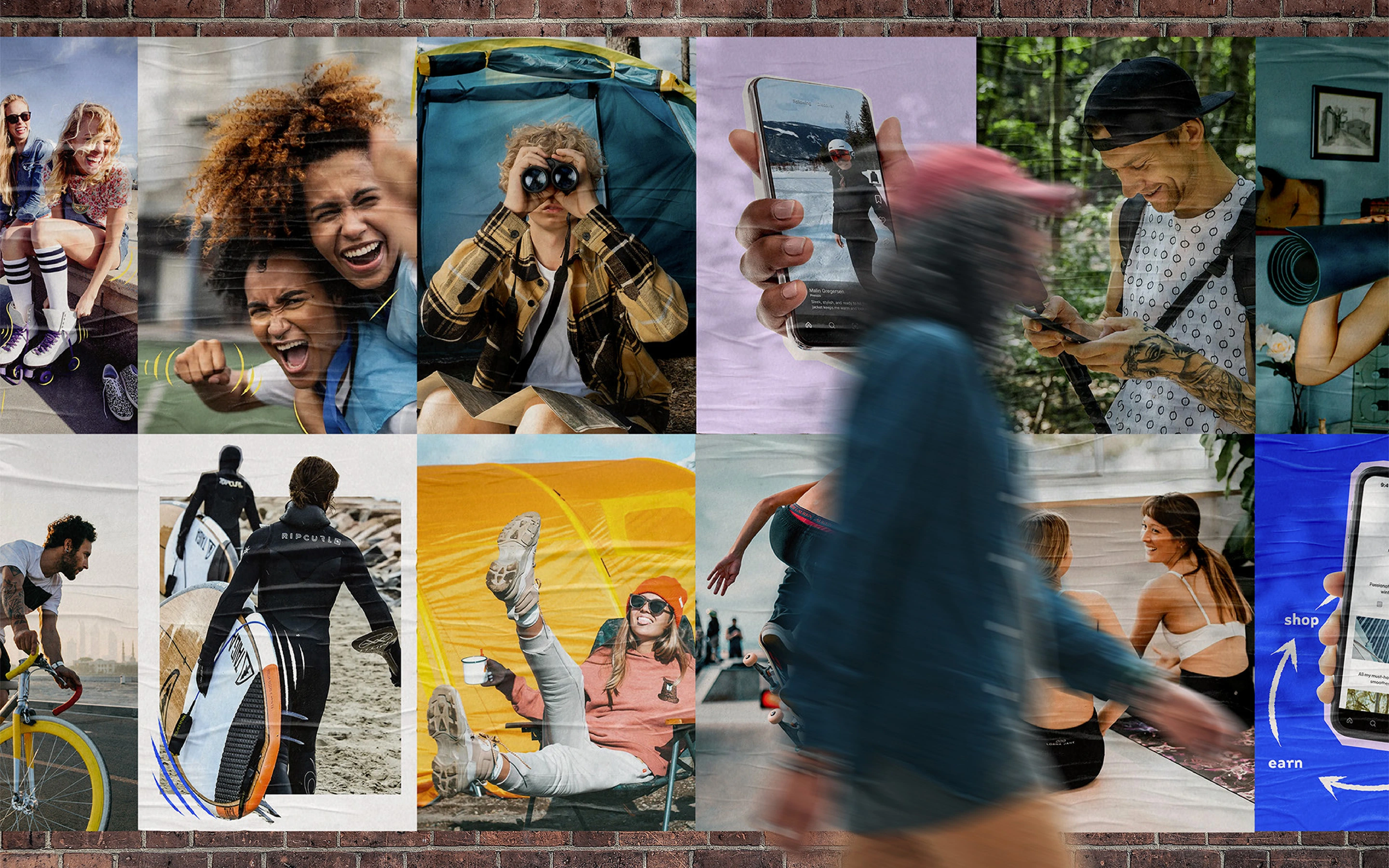
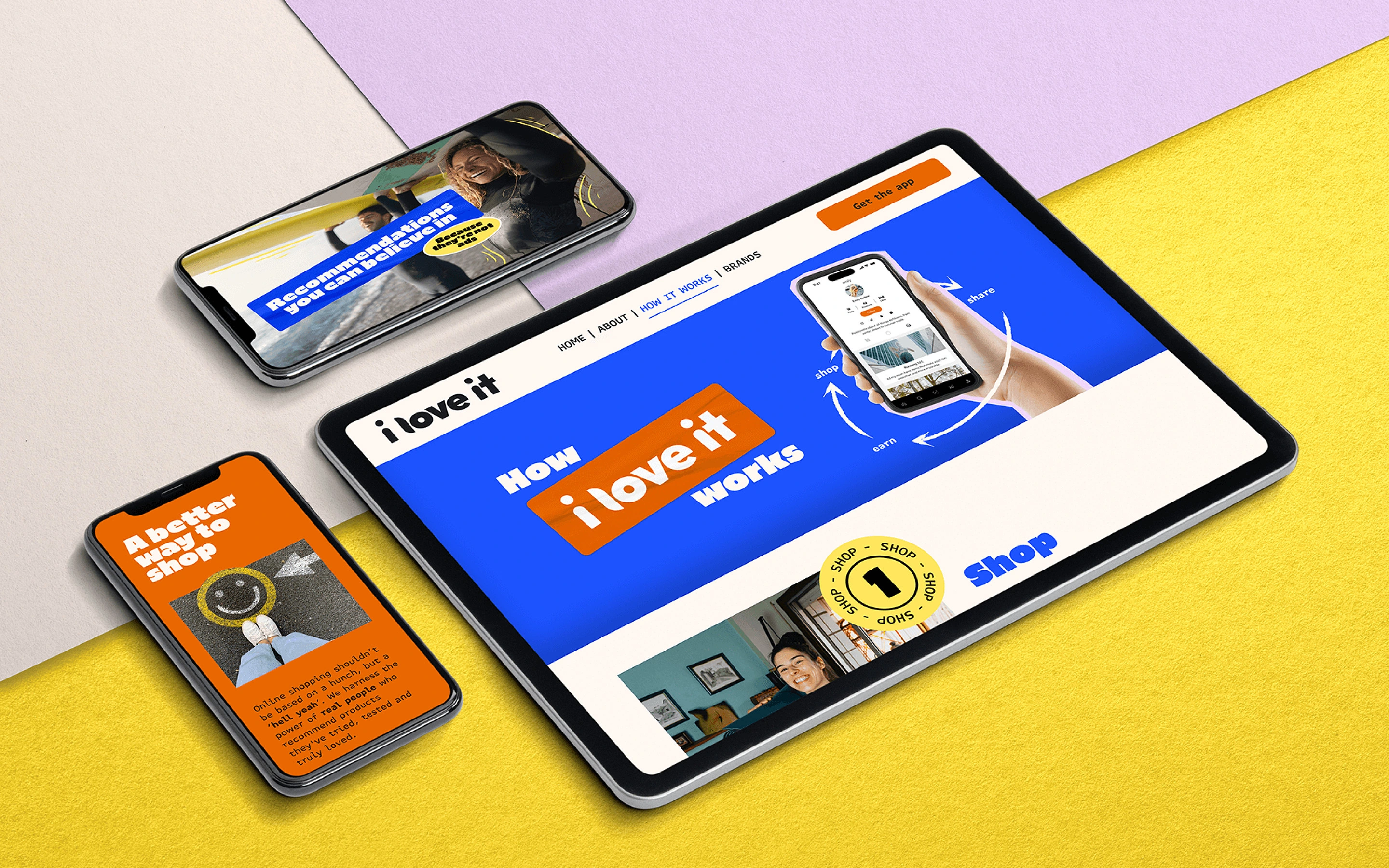
The photography showcases people in a flow state, authentically expressing their passions. Their figures are highlighted by coloured 'energy' lines which pulse around them to emphasise specific features. A high-impact palette pairs vibrant orange with electric blue, supported by lilac, yellow and paper tones.
For typography, Gaude Wide brings character and standout headlines, while FF Attribute grounds the system with a subtle nod to the AI-powered technology behind the platform. A retro sticker-pack aesthetic completes the flexible, expressive brand toolkit.
Deliverables
Brand personality workshop
Visual identity – logo, colourways, typography, iconography
Brand book + asset kit
Website design in Figma and built in Webflow, including CMS
App development – UI/UX design systems
Marketing materials + investor presentations
Instagram account setup + social tiles
Animation
"Working with Another Acronym and Dot & Peg on the branding for ‘i love it’ was a truly inspiring experience. Their ability to grasp the nuances of our mission – to create a trusted, passion-driven social commerce platform was remarkable. They took the time to deeply understand our values of authenticity, fairness, and community, translating them into a brand that feels fresh, compelling, and true to who we are. Their creative approach brought a new level of clarity and excitement to ‘i love it’, going beyond aesthetics to capture the essence of our vision. The team’s expertise and insight were invaluable, and they consistently exceeded our expectations with ideas that pushed the brand in a bold, impactful direction. I’m thrilled with the outcome and grateful for the collaborative process that brought it to life.” Ella d’Amato – CEO, i love it