
Superawesome
Repositioning SuperAwesome from ‘the kids company’ into a more refined youth tech-platform brand.
Challenge
SuperAwesome has strong recognition and a distinctive logo, but the wider brand system needed to catch up with where the business was heading.
The company was moving beyond a simple youth marketing position into a more sophisticated platform for safe, intelligent engagement with the next generation.
It needed to work harder across sales decks, product comms, partner materials, RFPs, case studies, real world events and a future website refresh. This meant we needed to deliver a robust and impressive design system as opposed to just a good looking brand book.
Approach
We treated the refresh as an evolution, as opposed to a reset. A brand workshop was orchestrated between New York, London and LA with surprising results from all the stakeholders and a new brand personality emerged consisting of 70% creator and 30% ruler (using the jungian archetype method).
The existing logo is recognised in the industry and so we built around it rather than starting again. The work focused on creating a clearer strategic and visual system: confident enough for enterprise partners, but embracing the energy and uniqueness of youth culture.
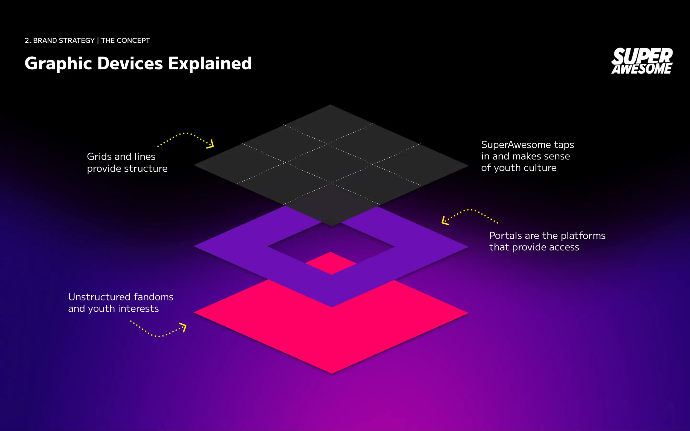
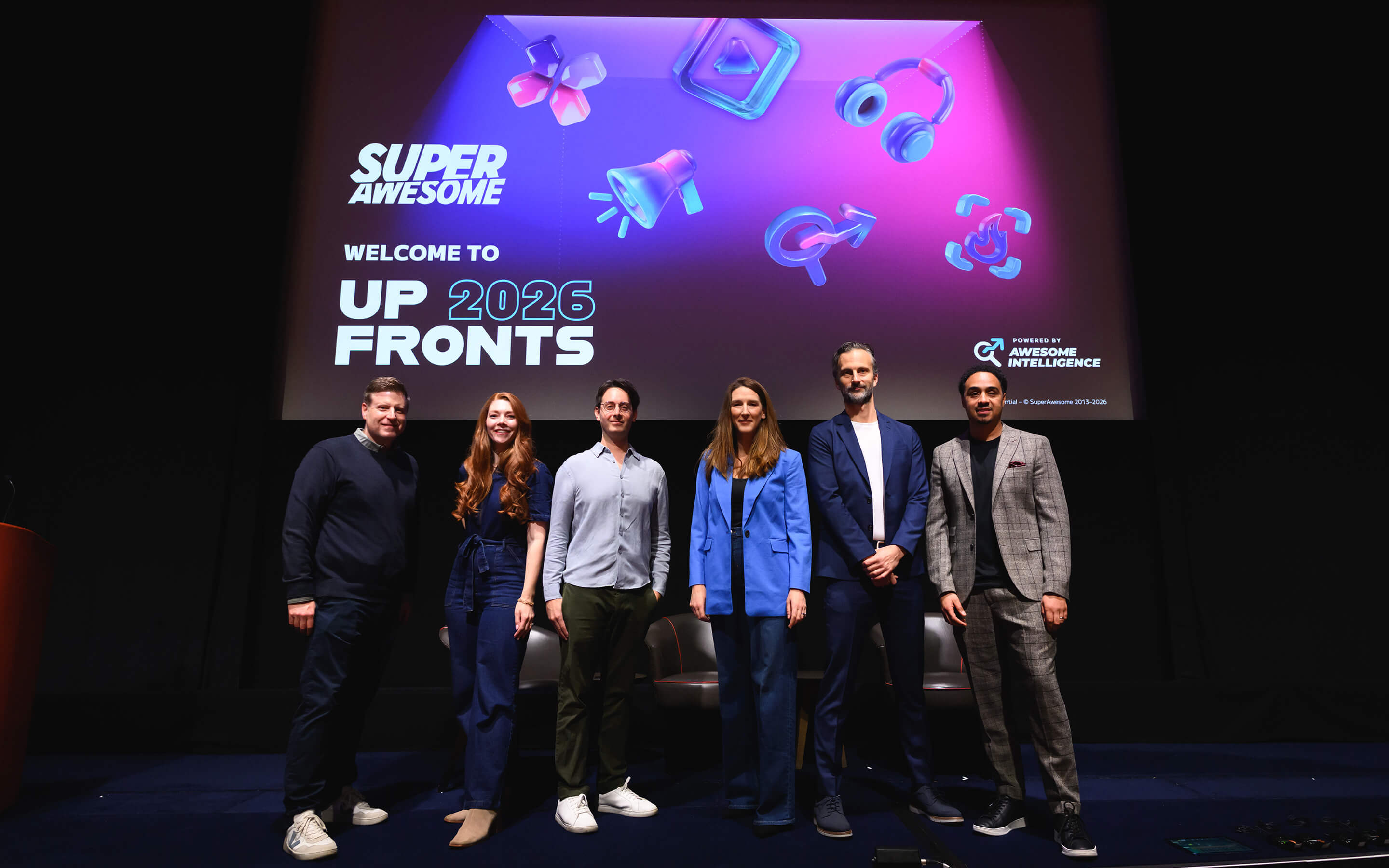
The central graphic idea became inter-dimensional portals. A flexible visual device for showing how SuperAwesome allows brands access to youth culture, fandoms, platforms and communities, while bringing structure to a noisy, fast-moving digital world.
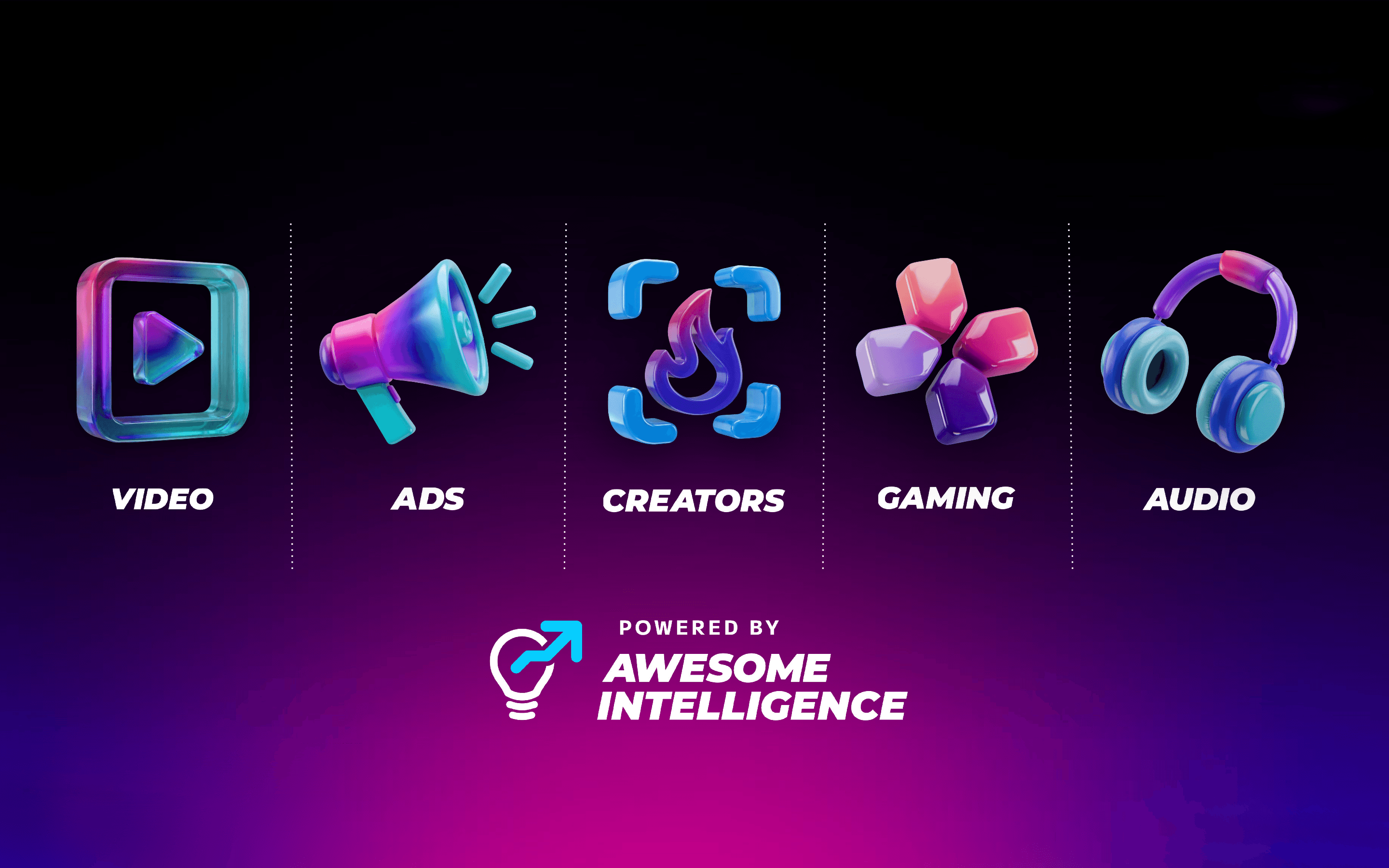
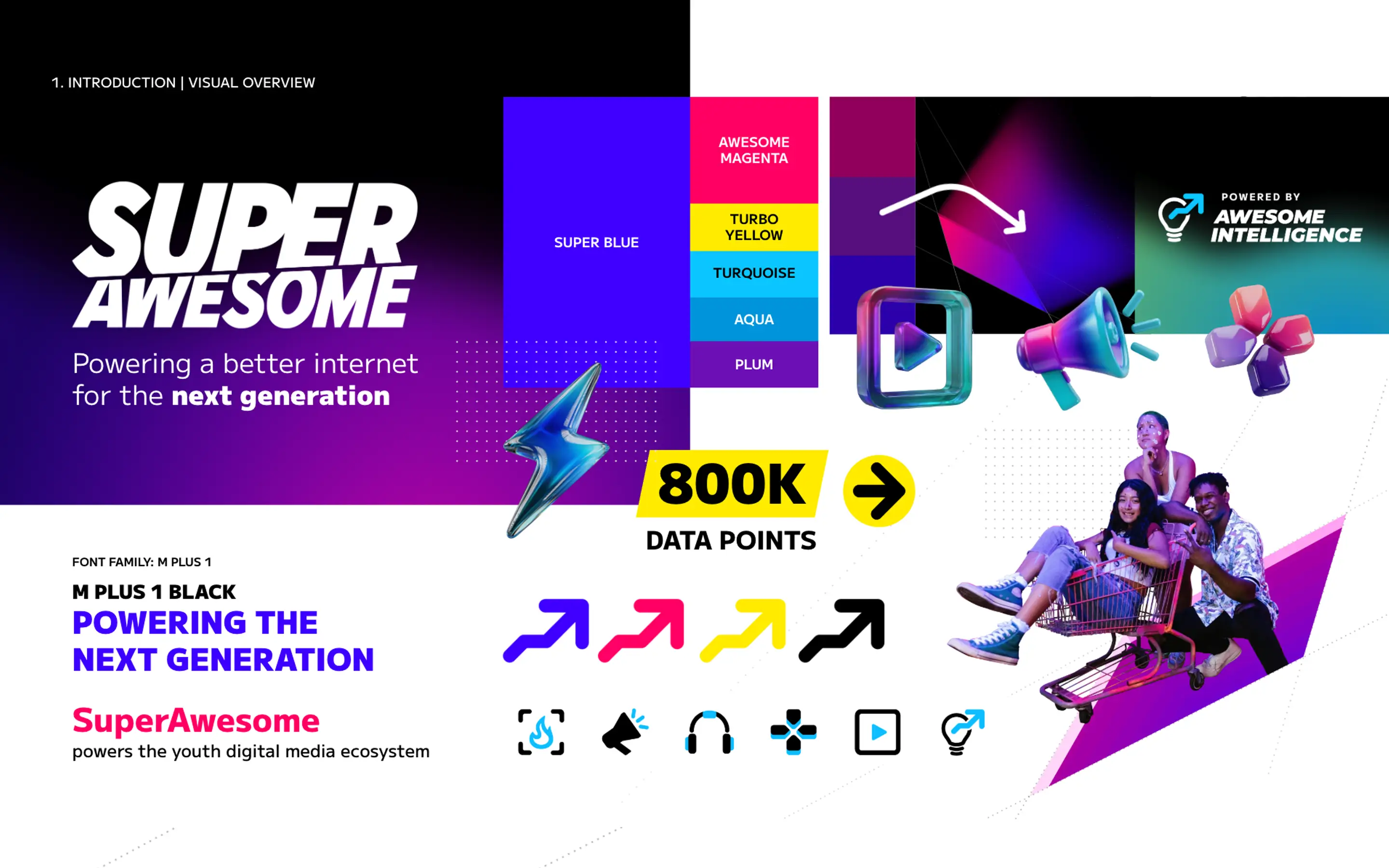
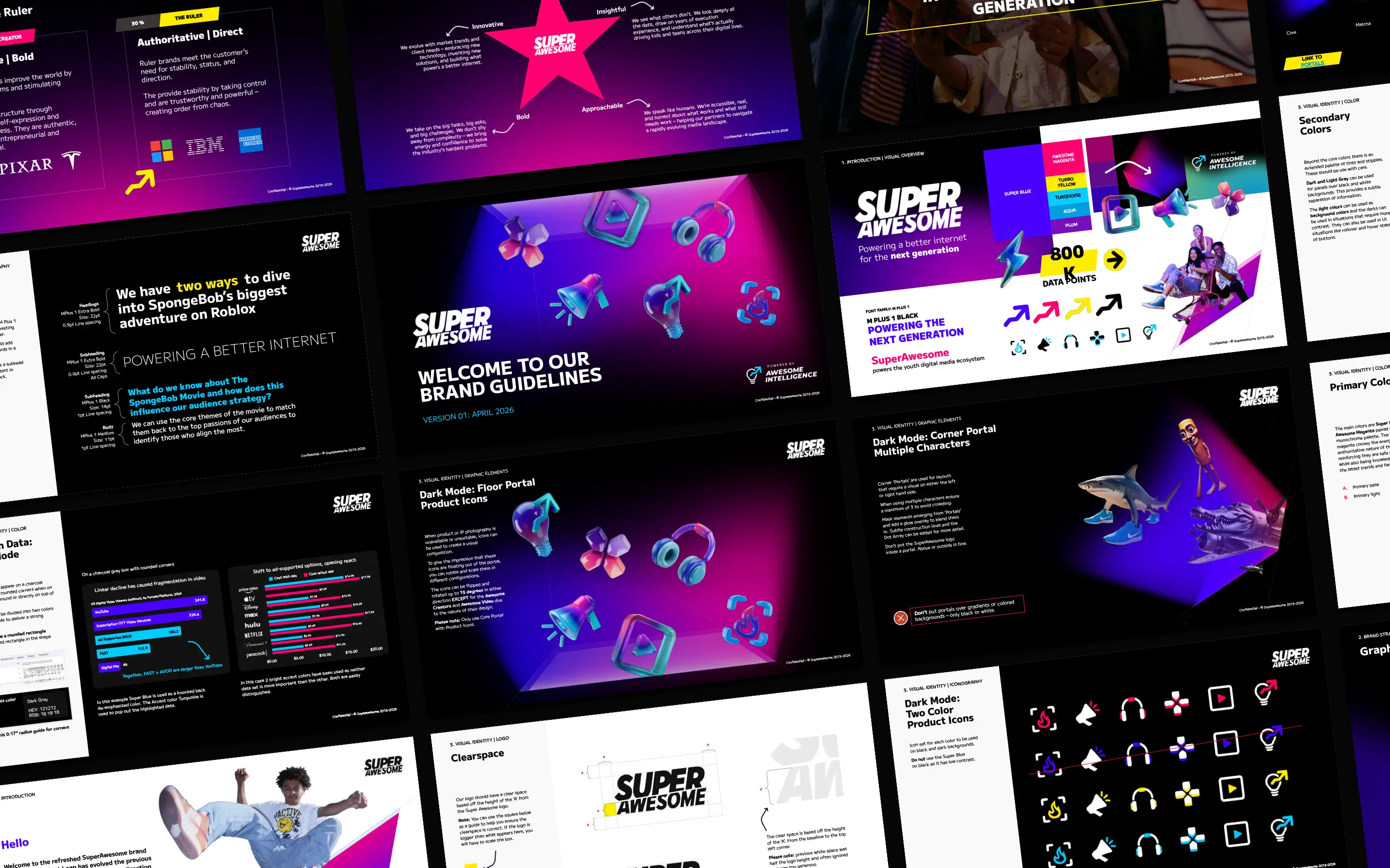
Around that idea we developed a dark-mode-first visual system with bold colour, 3D product icons, grid lines, dot arrays, data styles, motion principles, product lockups and practical layout rules. The aim was simple: give the in-house team something distinctive, scalable and hard to misuse.
Outcome
The refreshed brand gives SuperAwesome a stronger bridge between youthful energy and grown-up credibility.
It now feels like a modern technology company, without losing the colour, movement and cultural charge needed for a business built around the next generation.
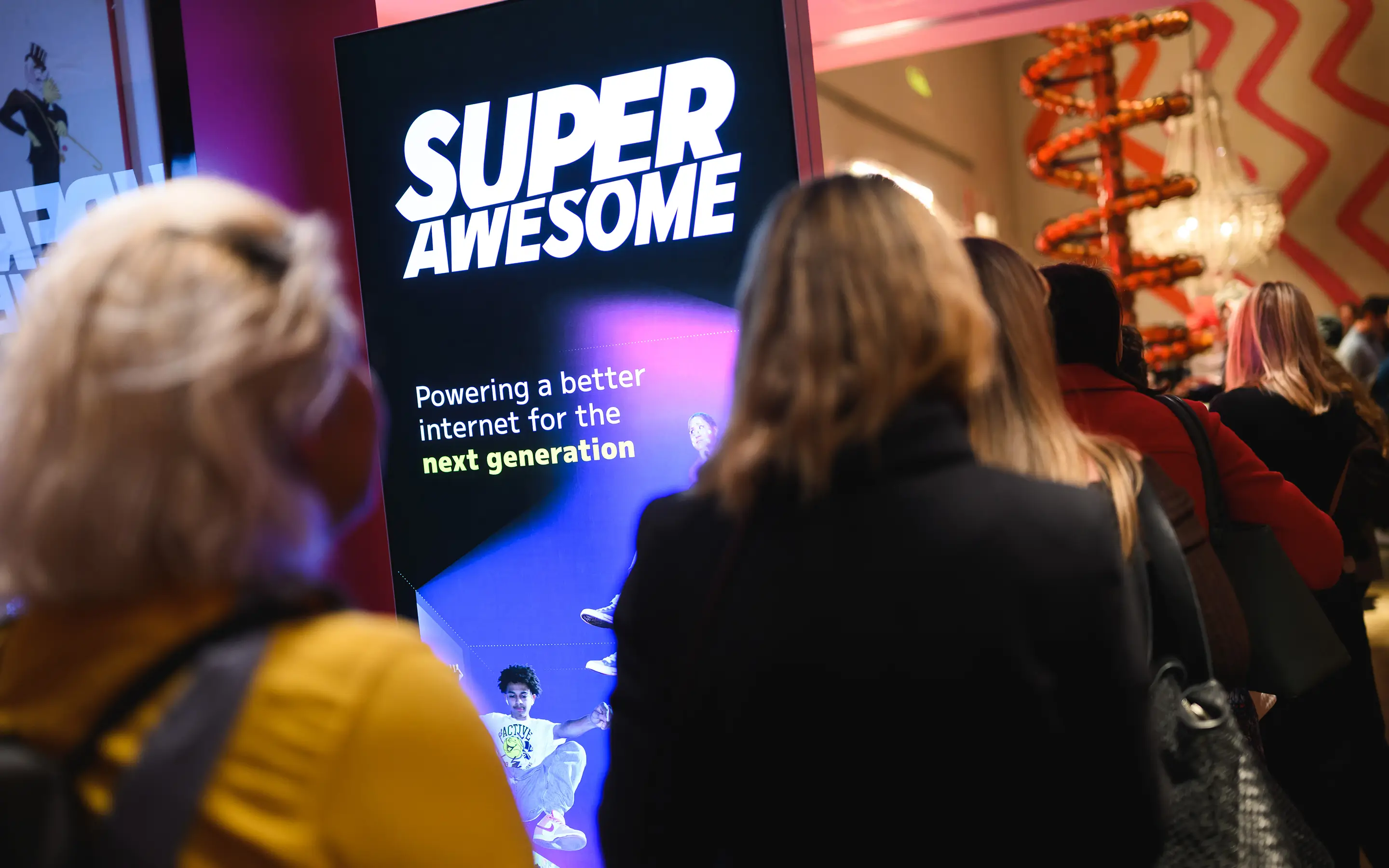
The system gives the marketing team a more consistent foundation toolkit for presentations, sales materials, product storytelling, reports, case studies, social assets and future digital rollout. It also gives internal teams clearer rules around accessibility, hierarchy, data visualisation, partner lockups and motion, so the brand can scale with consistency.
Deliverables
Brand strategy refinement
Brand personality and archetype definition
Core visual identity system
Colour, typography and layout rules
Portal graphic system
2D and 3D icon direction
Product and policy logo guidance
Motion principles
Presentation, RFP, one-pager and case study templates
Accessibility-aware colour pairings and data styling
Full brand guidelines and rollout toolkit
We came to Another Acronym looking to solve a perception problem: despite being a tech-driven platform serving Gen Alpha and Gen Z audiences, we were known by some clients as "the kids people" or "the compliance guys". Being seen as experts on youth audiences wasn't an accident - we'd built that reputation over a number of years - but we needed our brand to evolve and feel credible to a wider audience, without losing the essence of what had made us successful to begin with.
Katie and Noel's discovery workshops did the heavy lifting early on, pulling together a room full of different opinions, our business goals, and the competitive landscape, and shaping all of that into a single clear direction. That clarity made everything much easier as we moved through the process.
The process itself was genuinely collaborative. They pushed back on some of our assumptions in a way that moved us forward rather than slowing us down, and by the design phase it felt like they were part of the team rather than an external agency.
What stood out was the range of their expertise: from animation and 3D renders, to event branding, print, and genuinely detailed guidelines and templates. As a team, they balance creative ambition with practical usability as well as any agency I've worked with. The final design system and toolkit that Katie and Noel put together made rollout easy. They ran training sessions for teams internally, turned around requests for adjustments quickly, and the guidelines and templates they gave us were clear enough that adoption across the business happened without any friction. The work did what we needed it to: it moved SuperAwesome from being perceived as a "kids company" to a credible, mature, tech business, without losing the brand equity we'd already earned. I'd recommend Another Acronym to anyone in my network, and would work with them again without hesitation.
Lewis C. Hadley - Head of Marketing | SuperAwesome